Plan My Vote
Service Design

UX Design
Team Members:
Jessica Yokubonis, Peyton Crombie & Maggie Suino
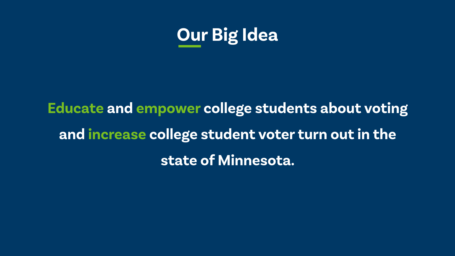
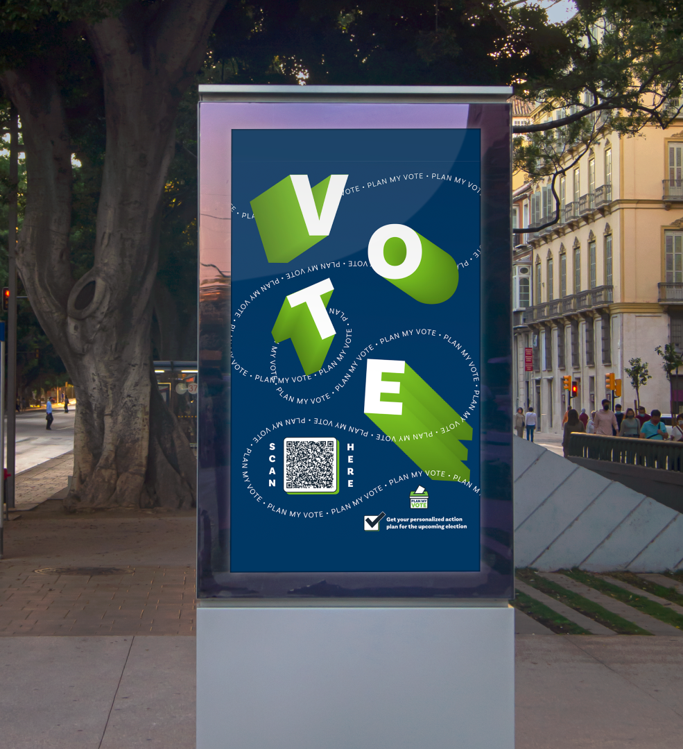
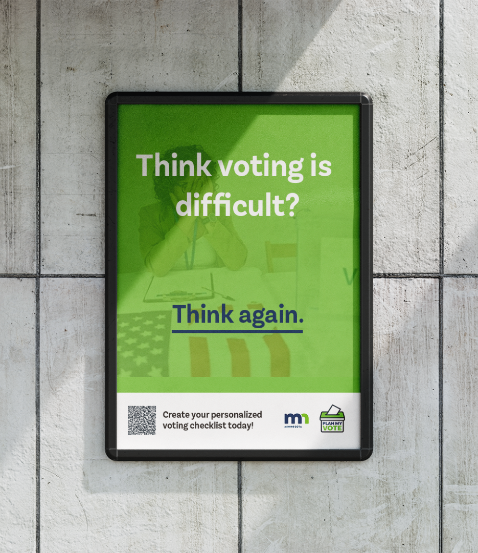
Plan My Vote is a personalized action plan for those confused and overwhelmed by the voting process. It is an online questionnaire fully integrated into the Secretary of State's website to increase youth voter turnout. Educating and empowering people to vote by ensuring they have all steps completed of the process when election day arrives.
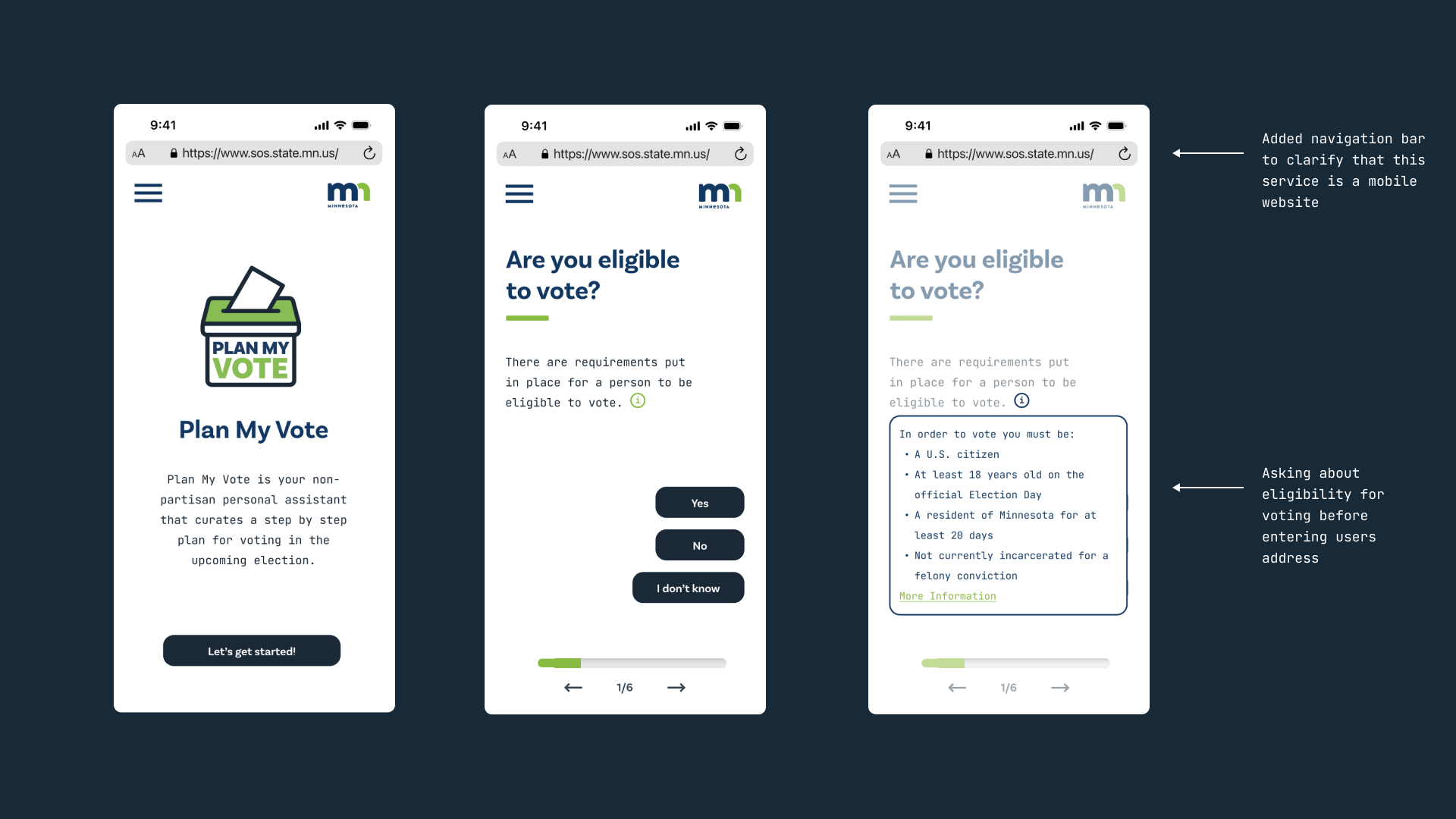
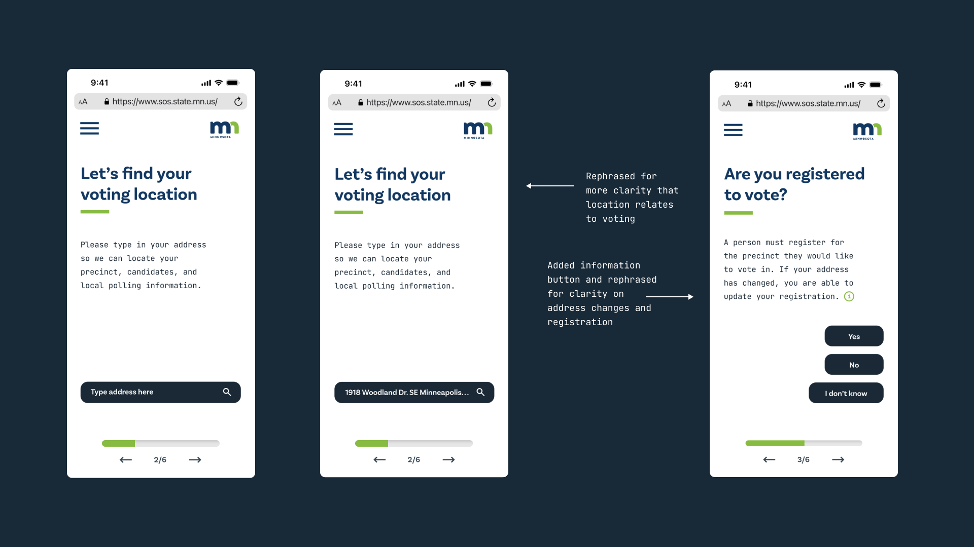
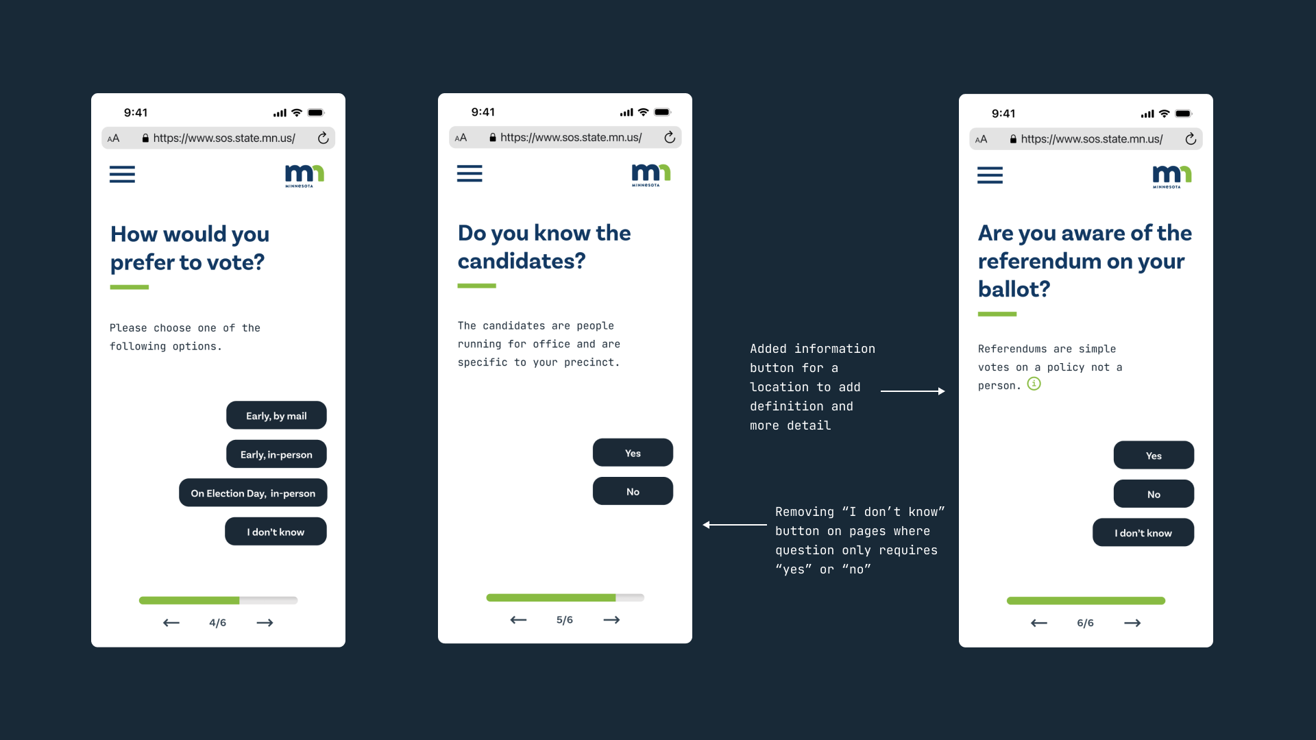
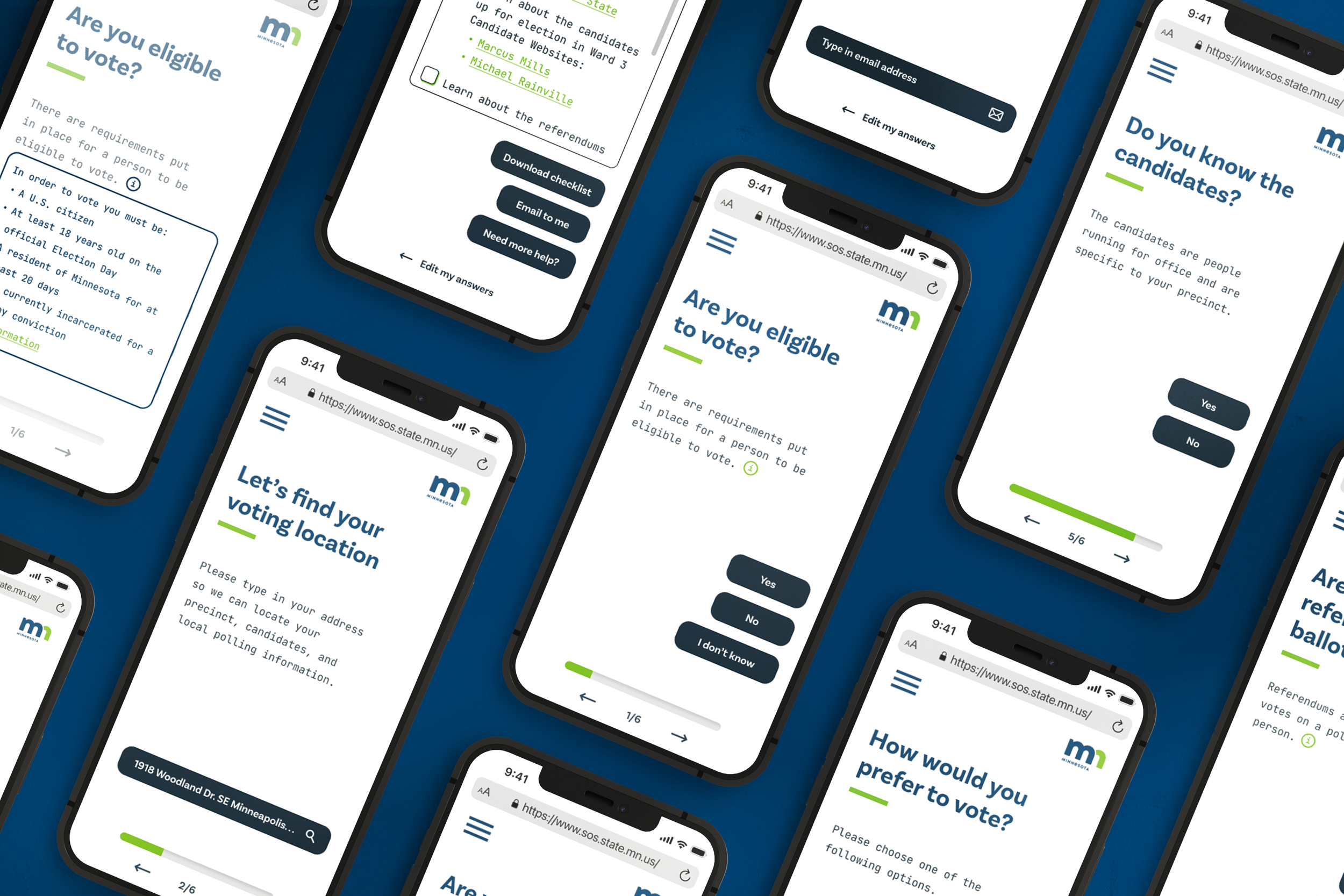
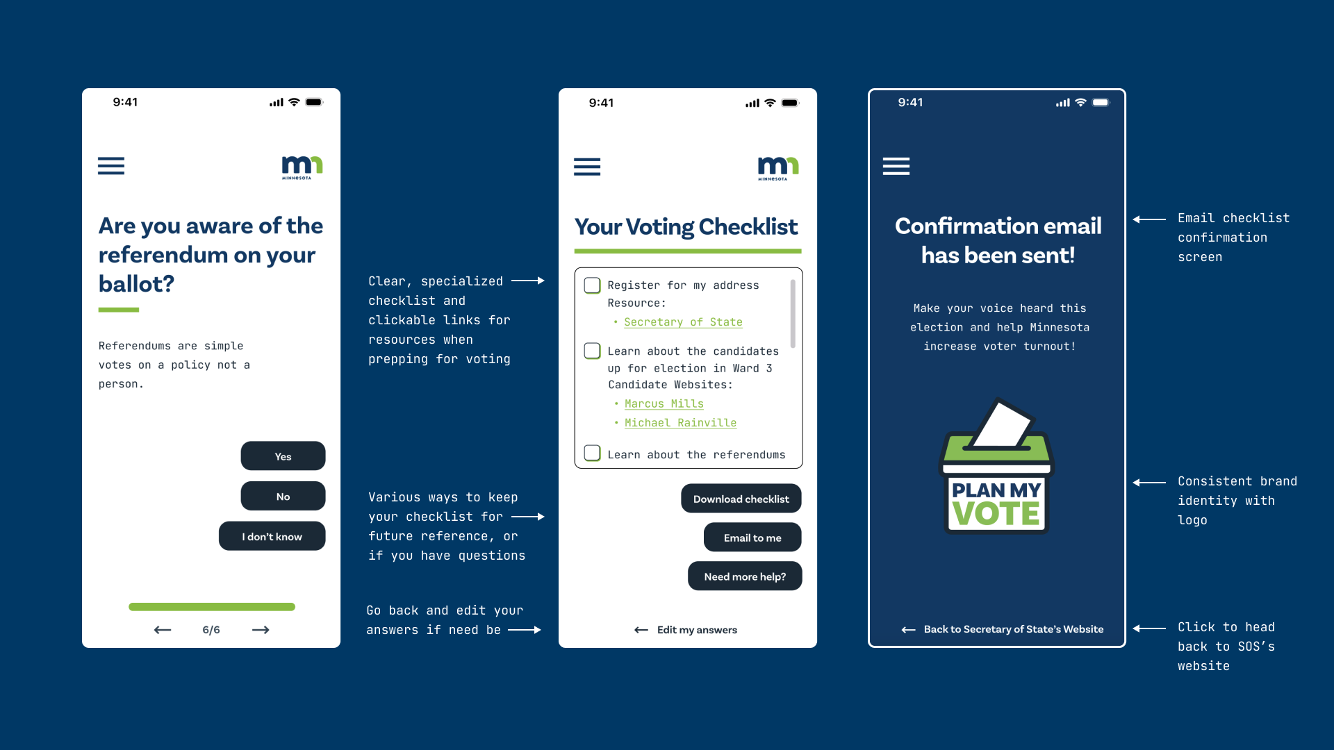
The result? Plan My Vote features a clean and intuitive interface, making it easy for users to navigate the questionnaire. With simple questions, Plan My Vote covers various aspects of the voting process, including voter registration, polling location, and local referendums. After completion, the user receives a personalized checklist for their precinct.
Final Prototype
The Process
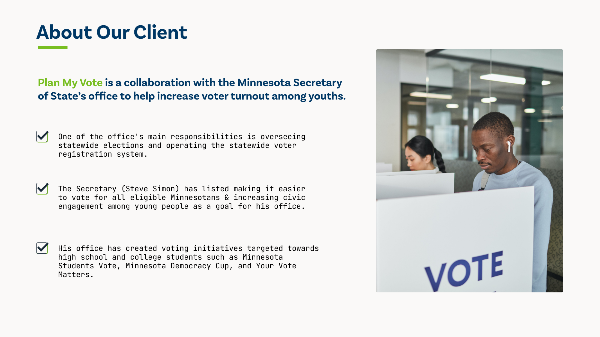
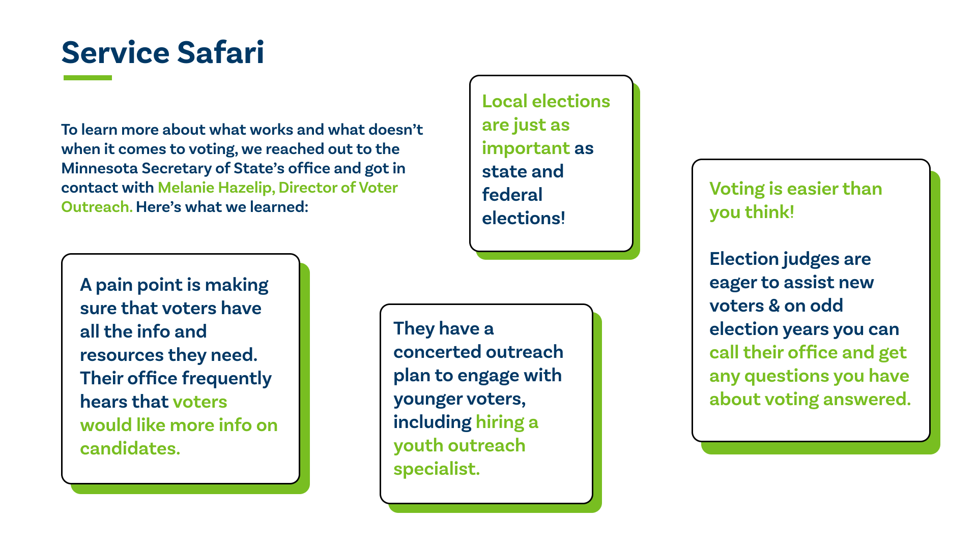
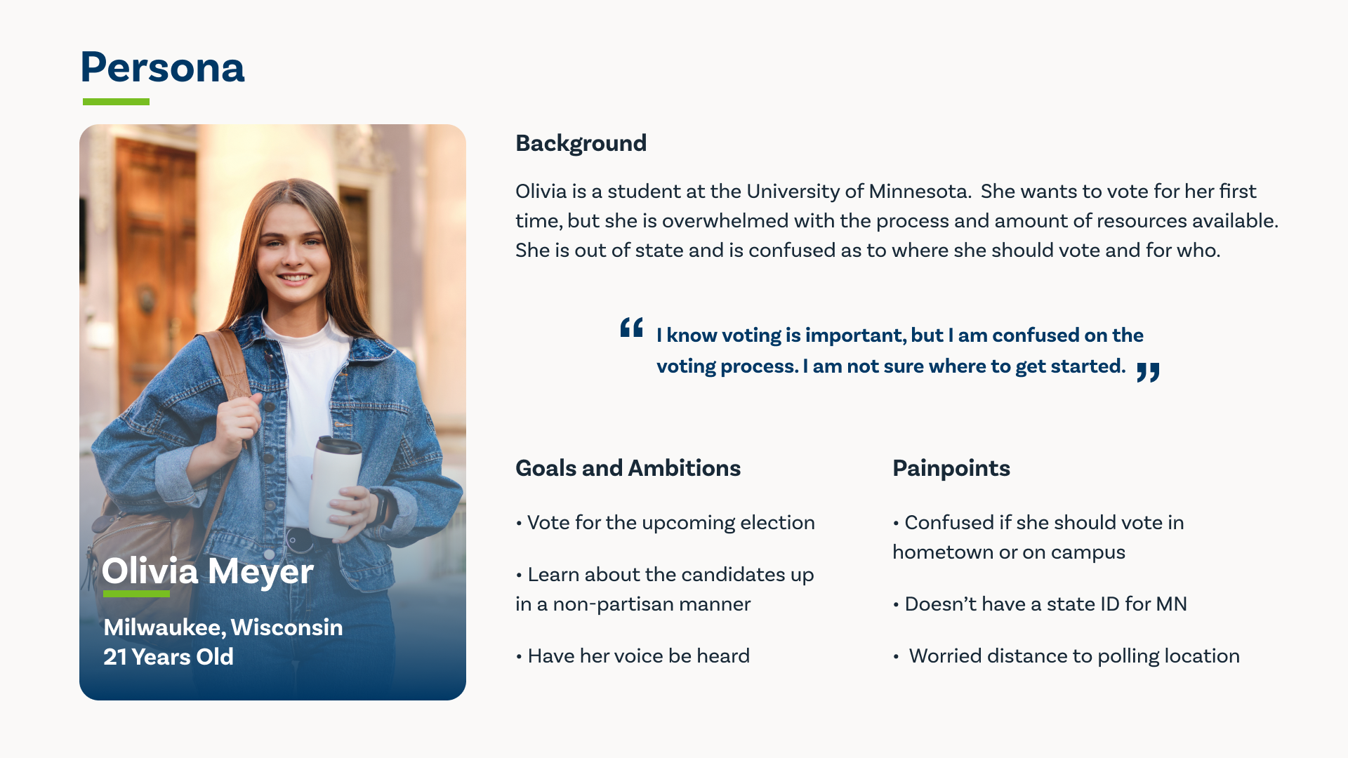
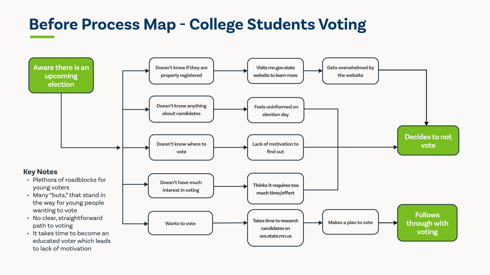
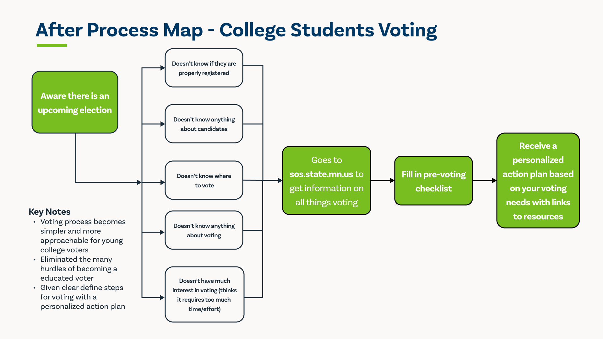
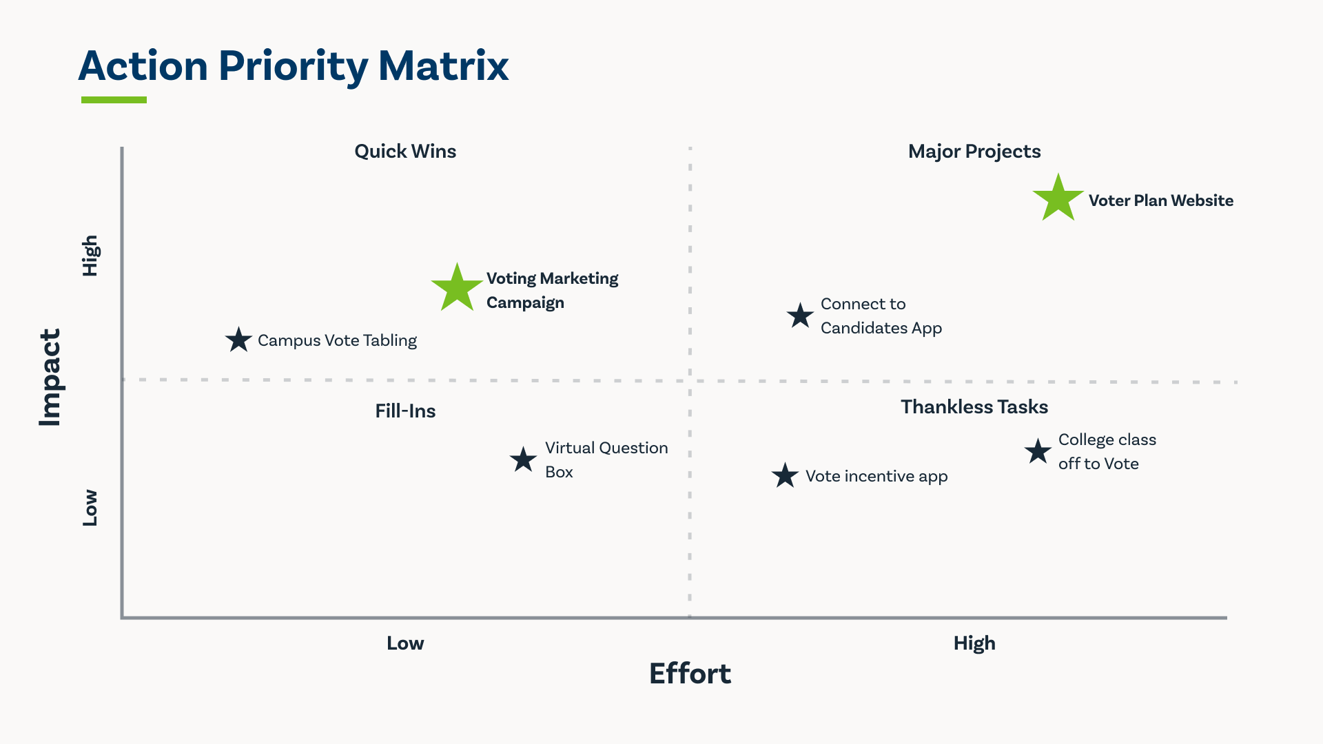
First, we had to get to know our client and understand the problem we were solving—this involved research, a service safari, creating a persona, and mapping our customer journey.
Click through the slideshow below to see our process.
Prototyping
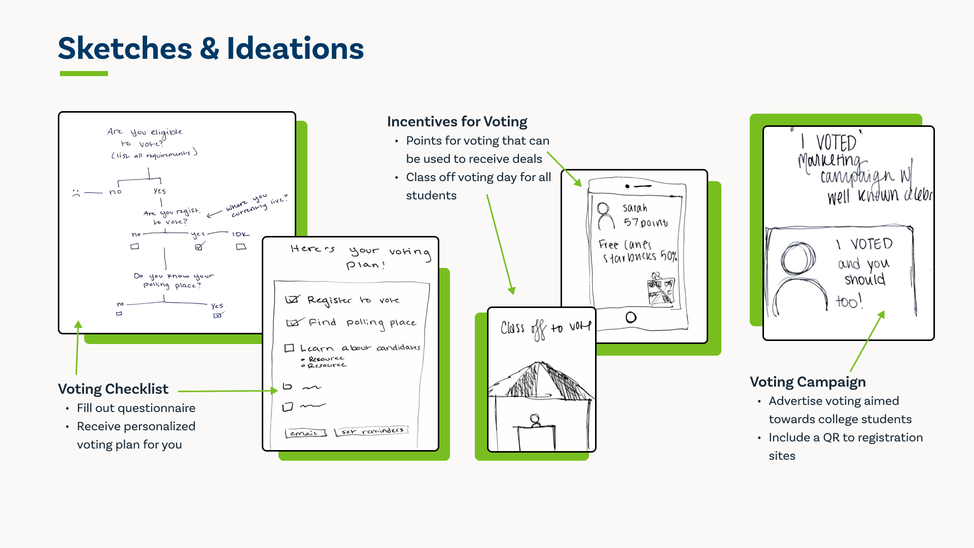
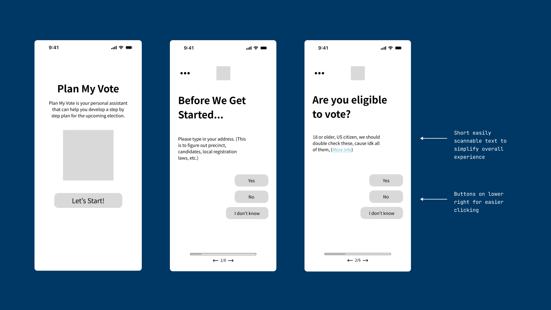
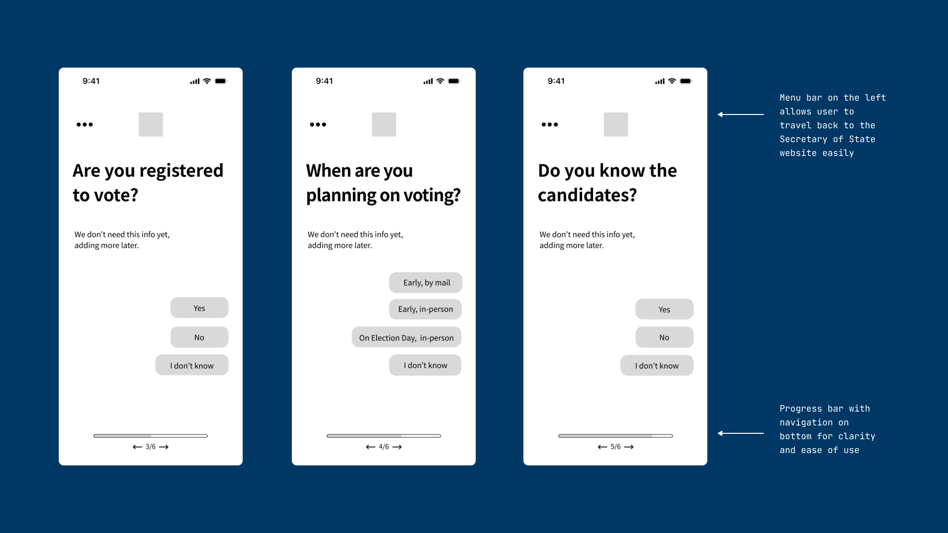
After we conducted research, a service safari, created our persona, and mapped our customer journey we were ready to create our prototypes.
First, you will see the Lo-Fi prototype screens.

Creating the Visual Identity
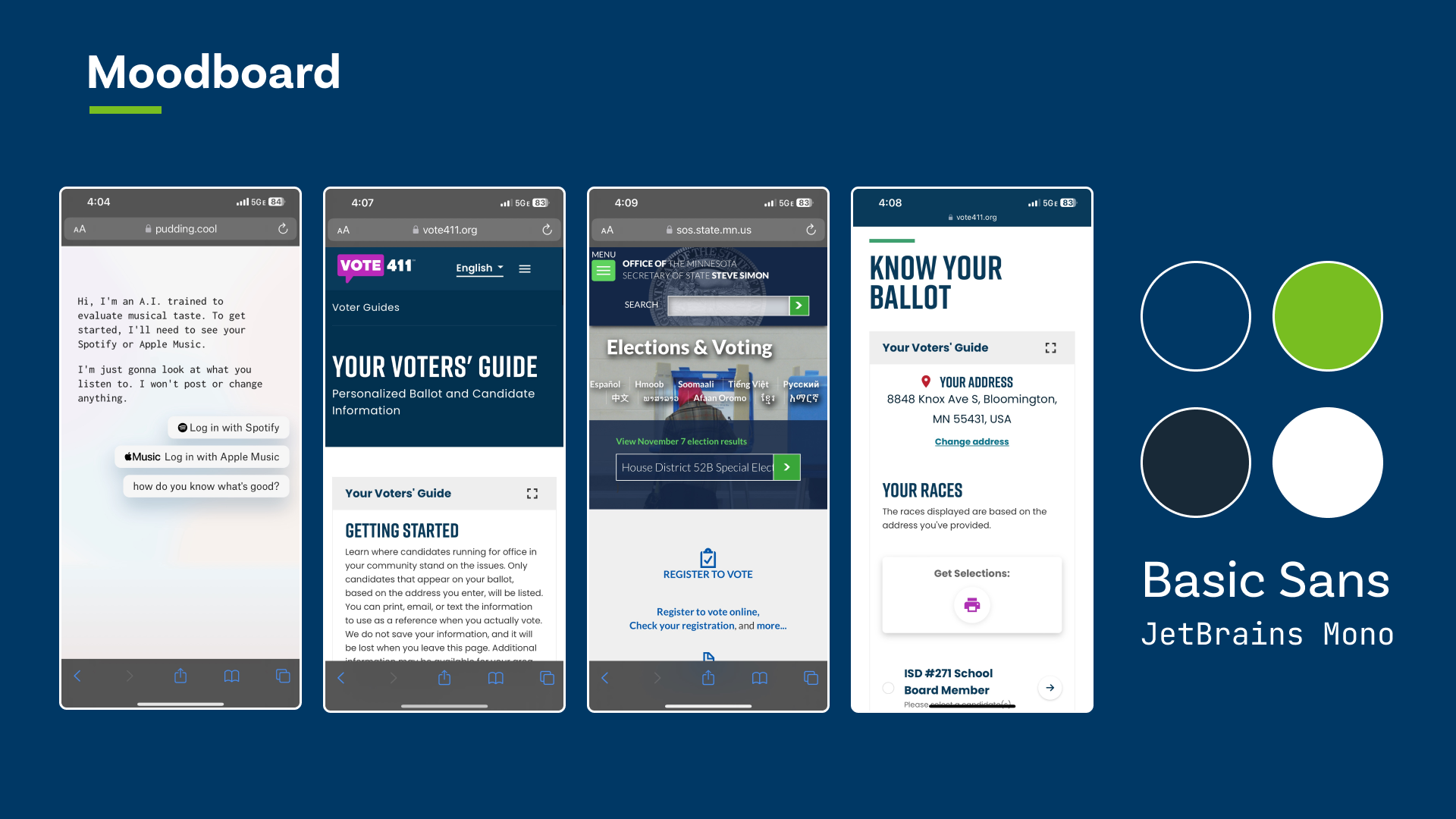
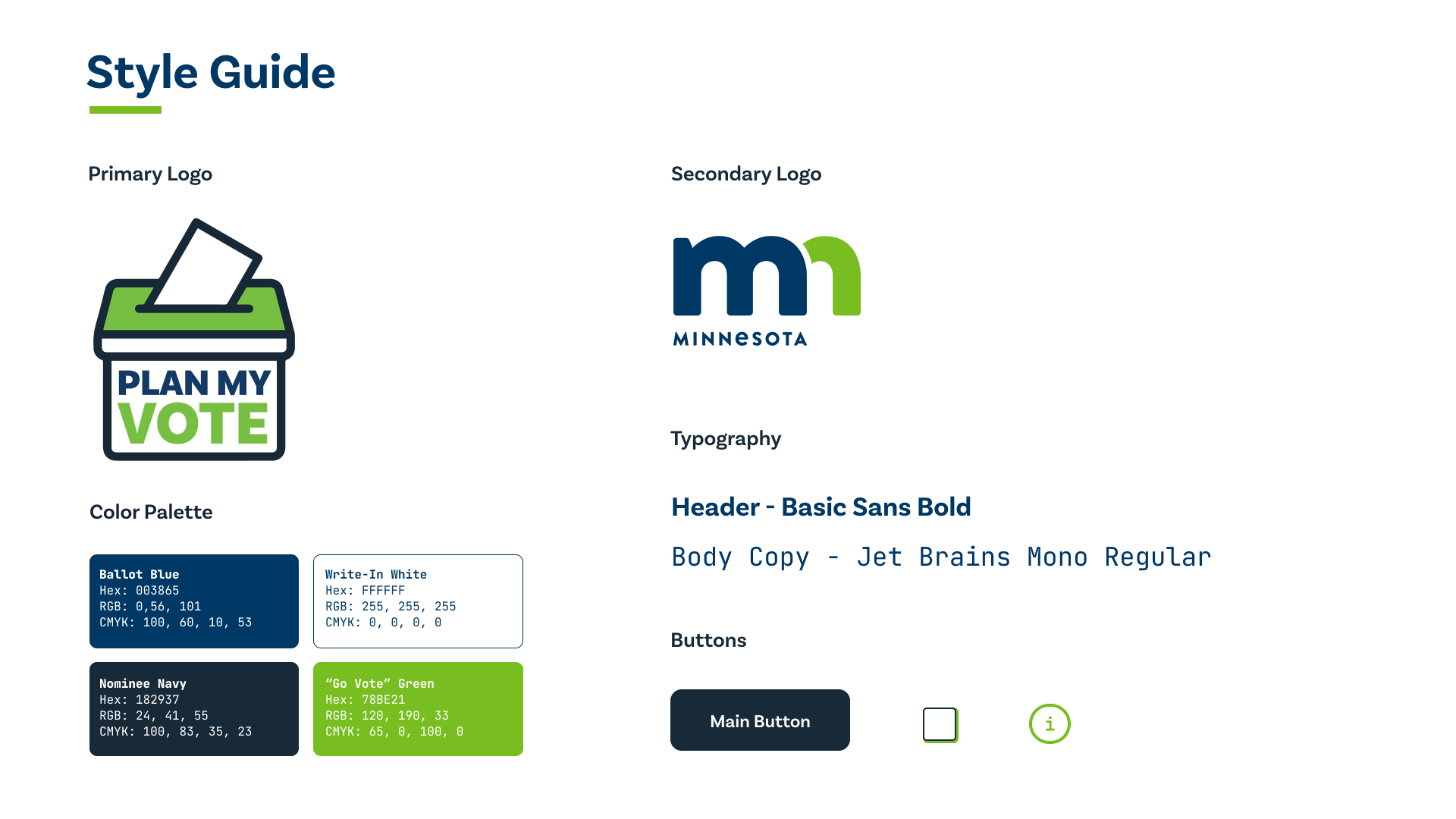
Before moving on to the Hi-Fi prototype, our team created the visual identity of the questionnaire. Since the Minnesota Secretary of State is our client for the program, we borrowed their “Minnesota Blue” and “Minnesota Green” with new names and a navy color for buttons and text for high contrast plus readability. Utilizing their colors allowed for a cohesive transition across the MN Secretary of State's website.
The questionnaire is meant to mimic a “chatbot” you might encounter on the Internet. We wanted the service to feel like a personal assistant that is helping you through the voting process. You will see below on our moodboard how the visual inspiration and use of colors translated into the style guide and final prototype.
Hi-Fi Prototype & Insights
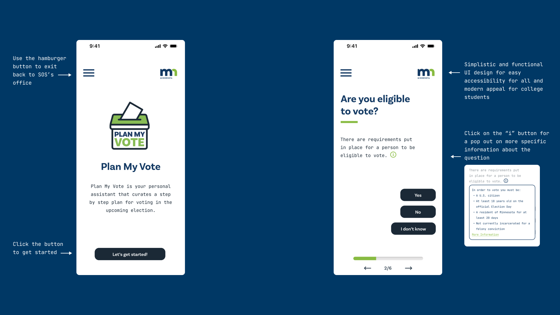
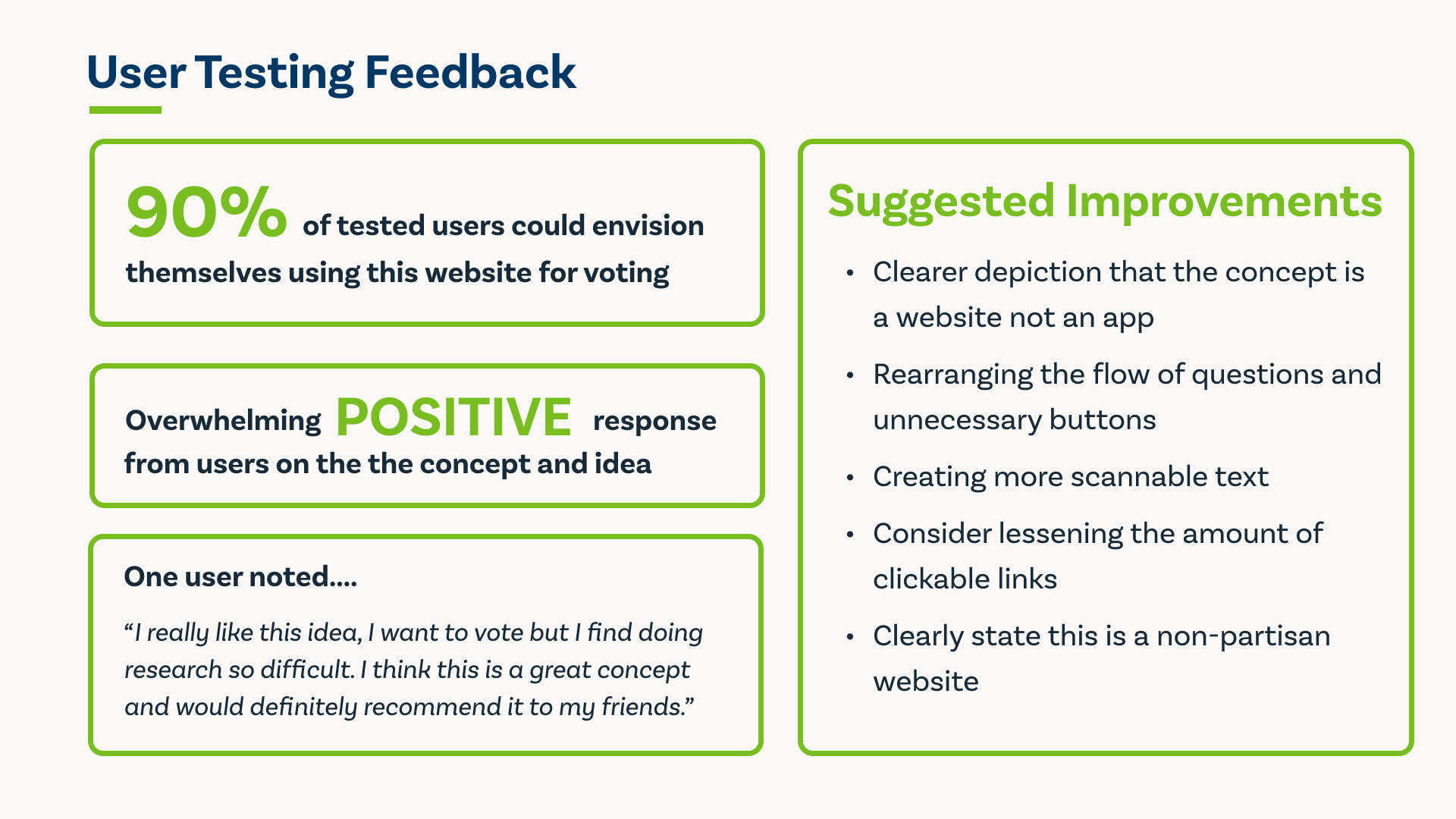
We created the Hi-Fi prototype using the style guide. Once created we gathered user feedback and insights. From there, we created the final prototype with our suggested improvements in mind.
Final Prototype & Conclusion
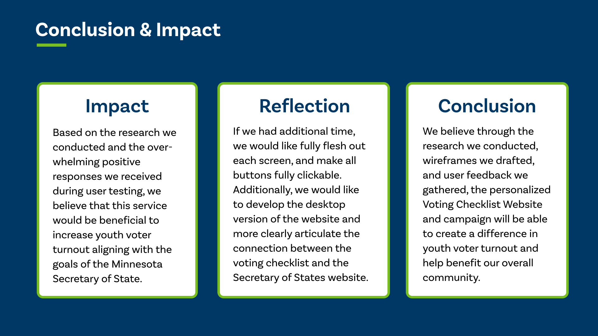
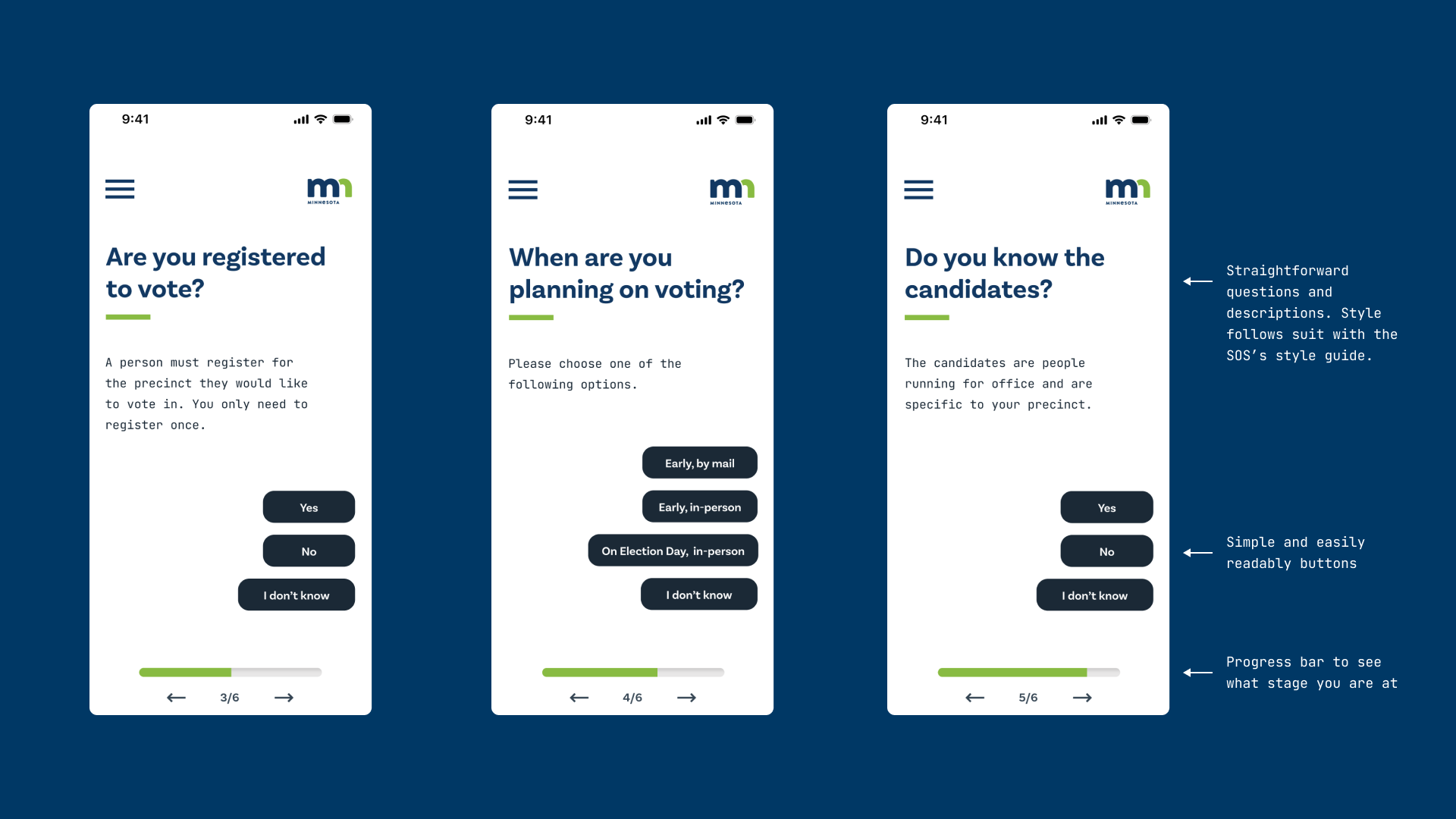
Lastly, we have our final prototype with annotations of the improvements we made. Along with our conclusion and the resources we used.
